PAYG App
Tesco Mobile faced a pivotal challenge: the 3G network switch‑off meant legacy PAYG customers risked losing access to digital services. At the same time, the business wanted to become digital first and consolidate two separate apps (PAYG and Pay Monthly) into one app.
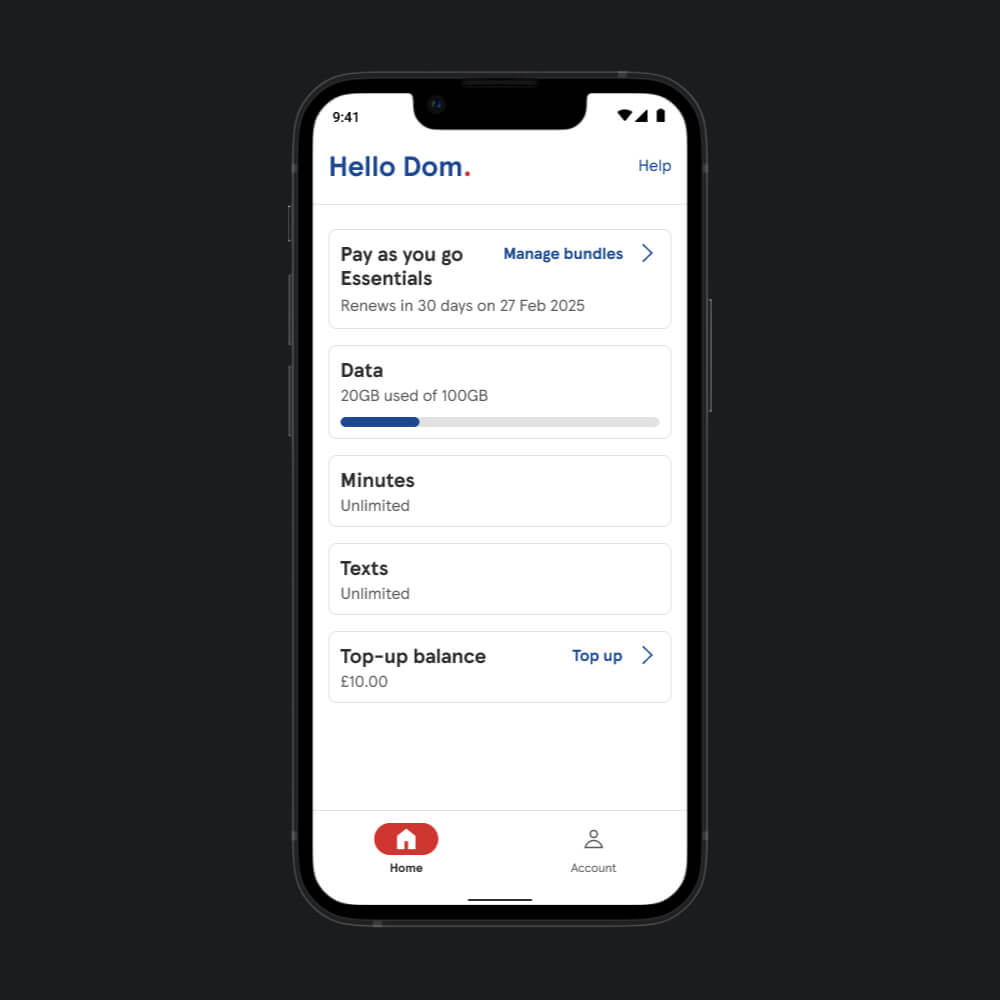
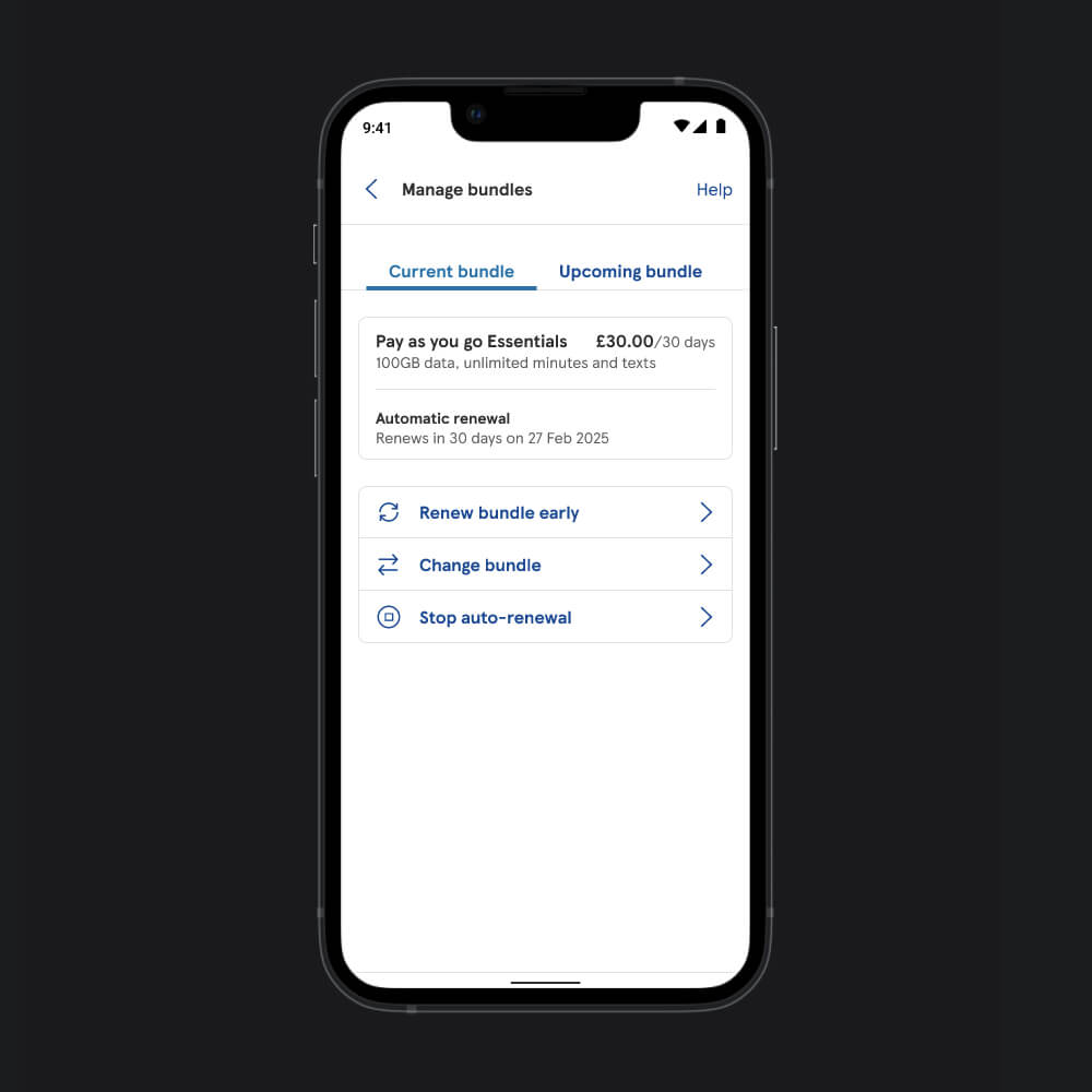
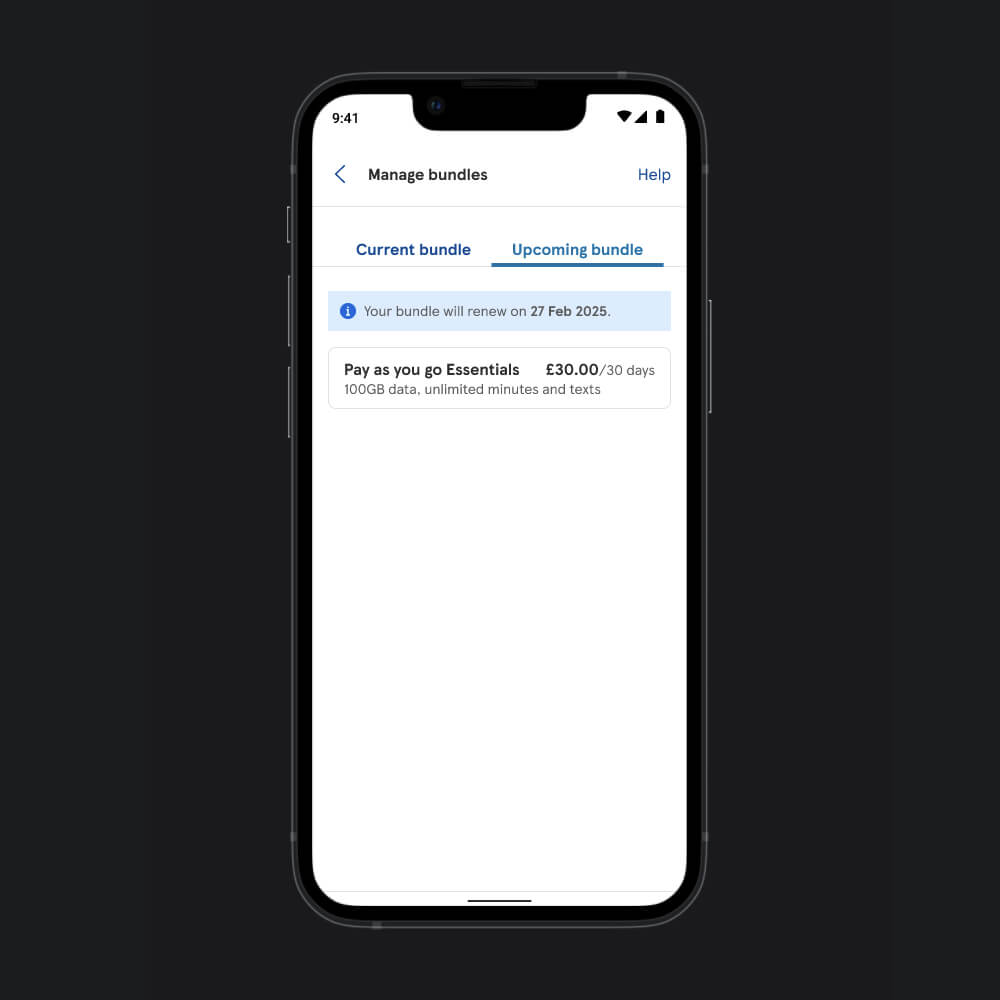
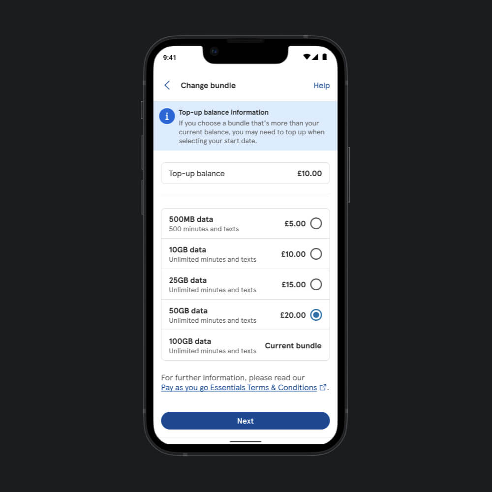
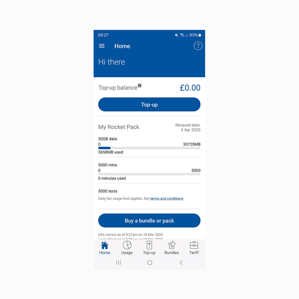
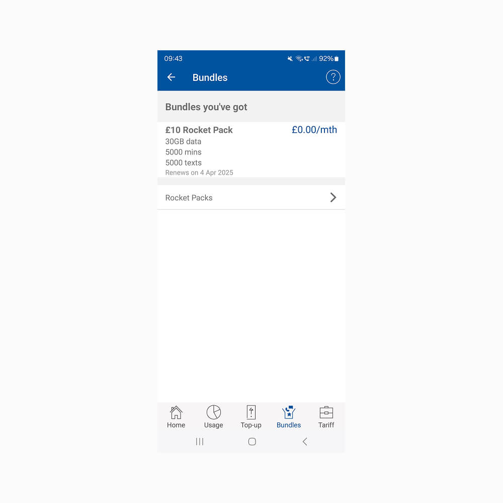
A key part of this transformation was enabling PAYG customers to self manage their bundles directly in the app, including the ability to change, renew, or stop bundles without needing to call up or visit retail. This not only supported the digital first strategy but also empowered customers with greater control and flexibility, while reducing operational overhead.
Product Designer
UX/UI Research, Analyse Competitor Research, Interface Design, Interaction Design, Wireframing, Analyse User Testing, Design System, Customer Journey Expert collaboration
- Product Designer (Me)
- Customer Journey Expert
- Customer Experience Expert
- Product Owners
- BA
- iOS and Android Developers
- QA
- Figma
- Tesco's Native Design System Library
- Tesco Mobile's Design System Library (I created)
- UserZoom
- Webaim Colour Contrast
- Mobbin
- Multiple Competitor SIM Purchases
- Jira
- Slack
- Microsoft Teams
18 months
Deliverables
- Unify PAYG and Pay Monthly into one app
- Streamline top‑up and billing journeys to reduce friction
- Future‑proof the experience for the 3G switch‑off
- Scale through a robust design system aligned with Tesco’s core system
- Empower customers with self‑service control, allowing customers to seamlessly change, renew, or stop their bundles
Challenges
There are 5 parts to this:
1. Complex Journey Alignment
Merging PAYG and Pay Monthly into one app required multiple iterations of the customer journey. Each revision had to balance two distinct sets of needs, which often introduced friction and forced trade‑offs in navigation and information hierarchy.
2. System‑Led Constraints
Backend systems dictated what data could be surfaced and when, which limited design flexibility. This meant the UX often had to adapt to technical dependencies, leading to several re‑design cycles to ensure journeys still felt seamless.
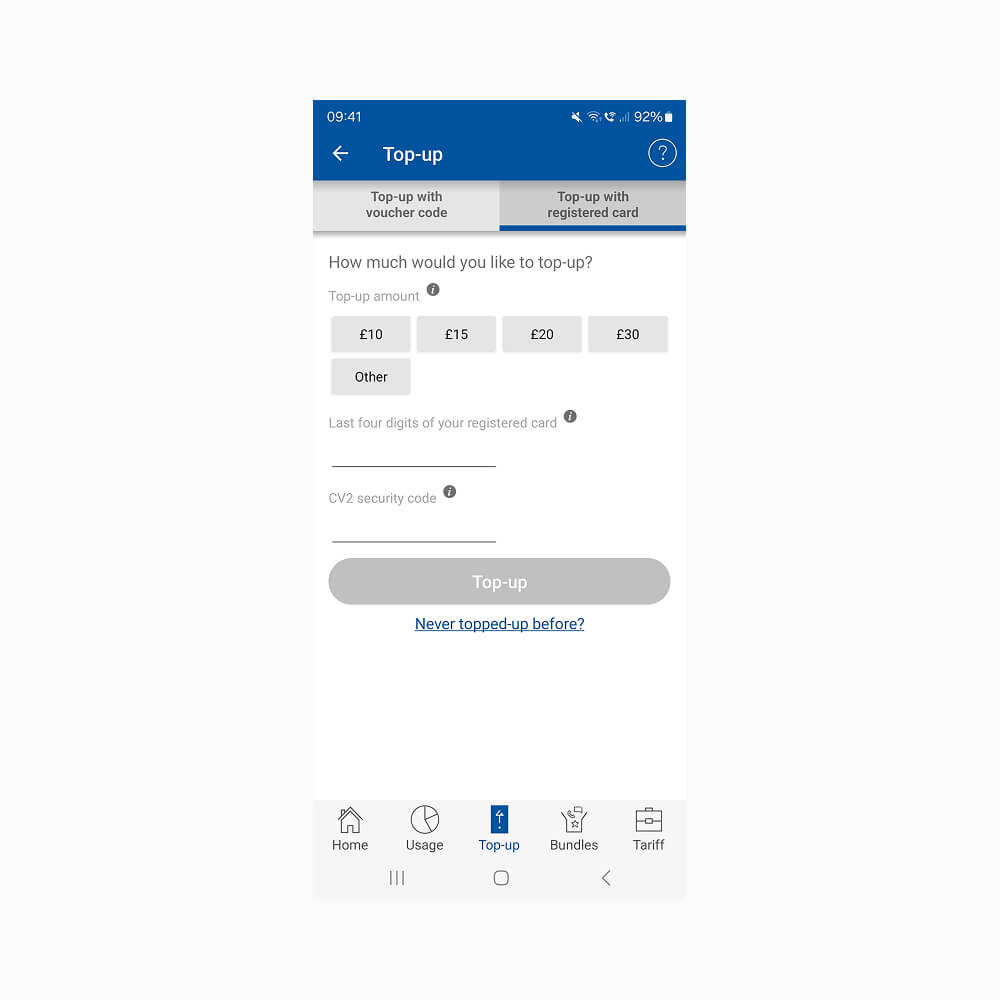
3. Top‑Up and Bundle Management Flow Simplification
Streamlining the PAYG bundle management and top‑up process was not straightforward. Legacy payment flows and compliance requirements meant the team had to test and refine multiple prototypes before achieving a reduced, three‑step journey that was both compliant and user‑friendly.
4. 3G Switch‑Off Readiness
Future‑proofing the app for the 3G switch‑off required designing for customers who were less digitally confident. Iterations focused on simplifying onboarding and ensuring fallback options, which added complexity to the UX design process.
5. Design System Integration
Scaling through the Tesco Design System meant every new PAYG component had to be reusable and consistent with existing patterns. This required close collaboration with the design system team and multiple iterations to align visual language, naming conventions, and interaction logic.
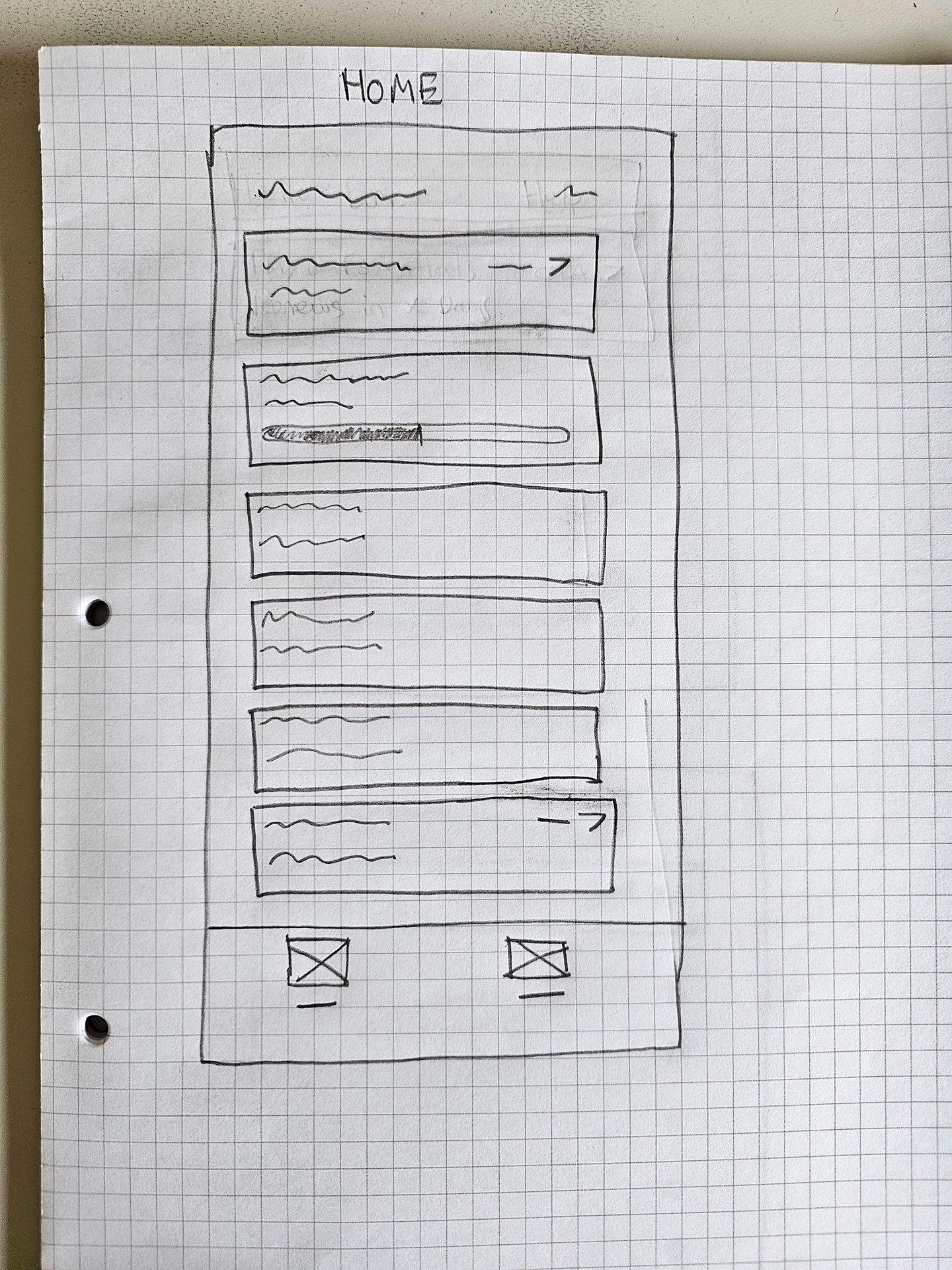
Ideation
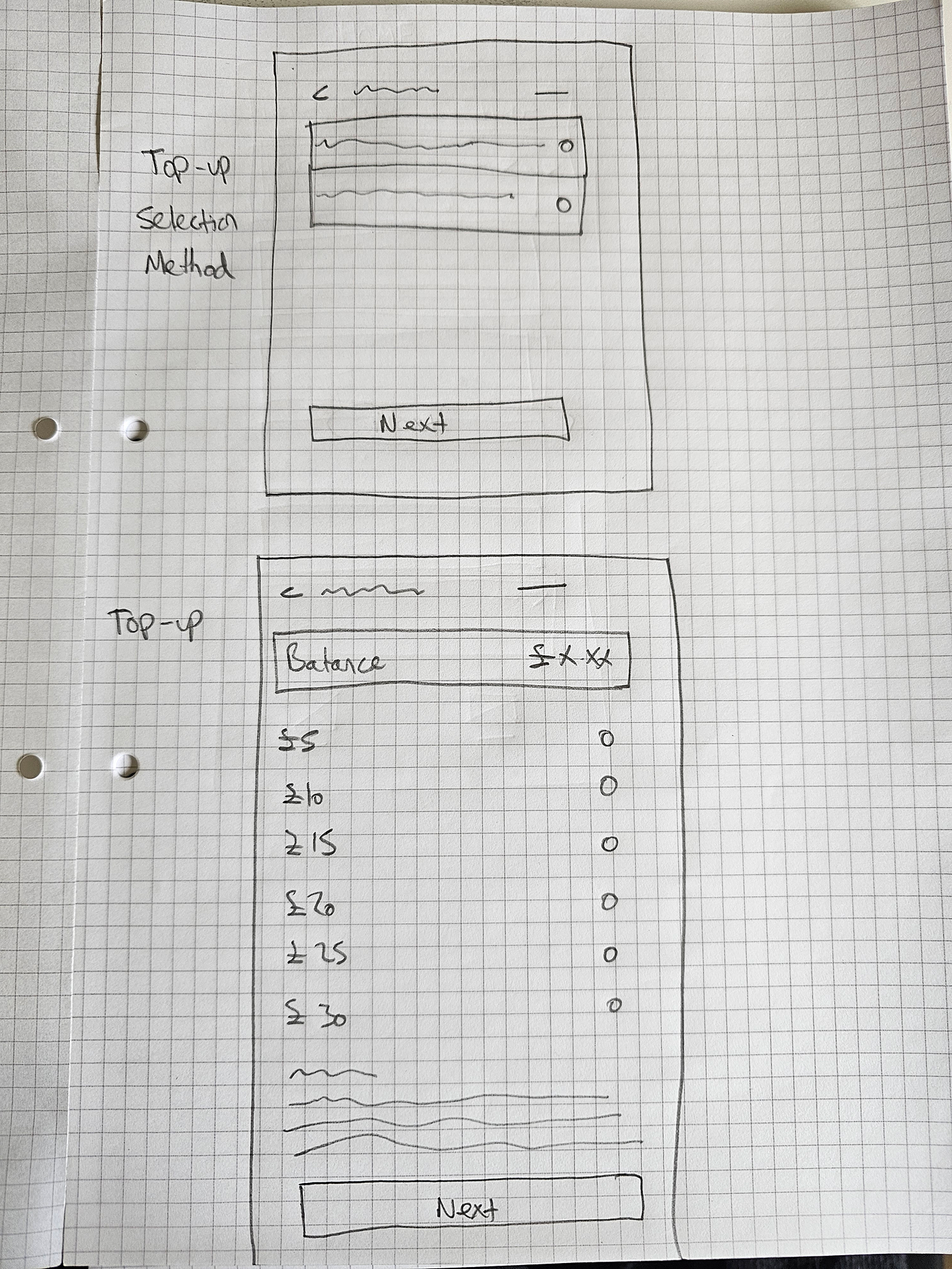
The team and I began by mapping customer journeys to uncover where PAYG and Pay Monthly experiences overlapped or diverged. Multiple navigation models were sketched and wireframed, exploring both shared and separate pathways. Co‑creation workshops with stakeholders helped align on priorities, while the design system was extended with new PAYG specific components to ensure consistency and scalability across the unified app.
Below is the one of the sketches of one of the journeys (top-up):
Testing
All proposed journeys and design iterations were validated through user testing in UserZoom. Feedback showed strong alignment with user expectations, with only minor adjustments required. Overall, the testing revealed little conflict between PAYG and Pay Monthly needs, confirming that the unified app approach was both intuitive and effective.
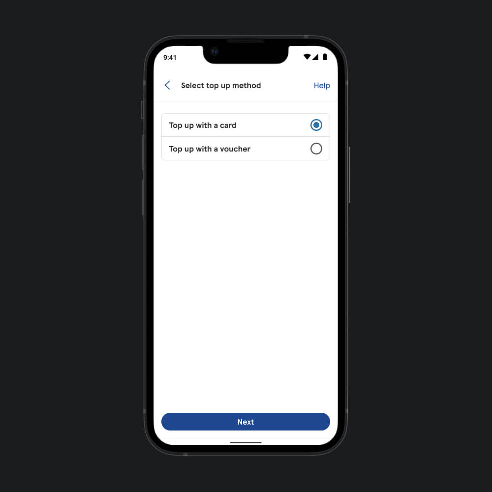
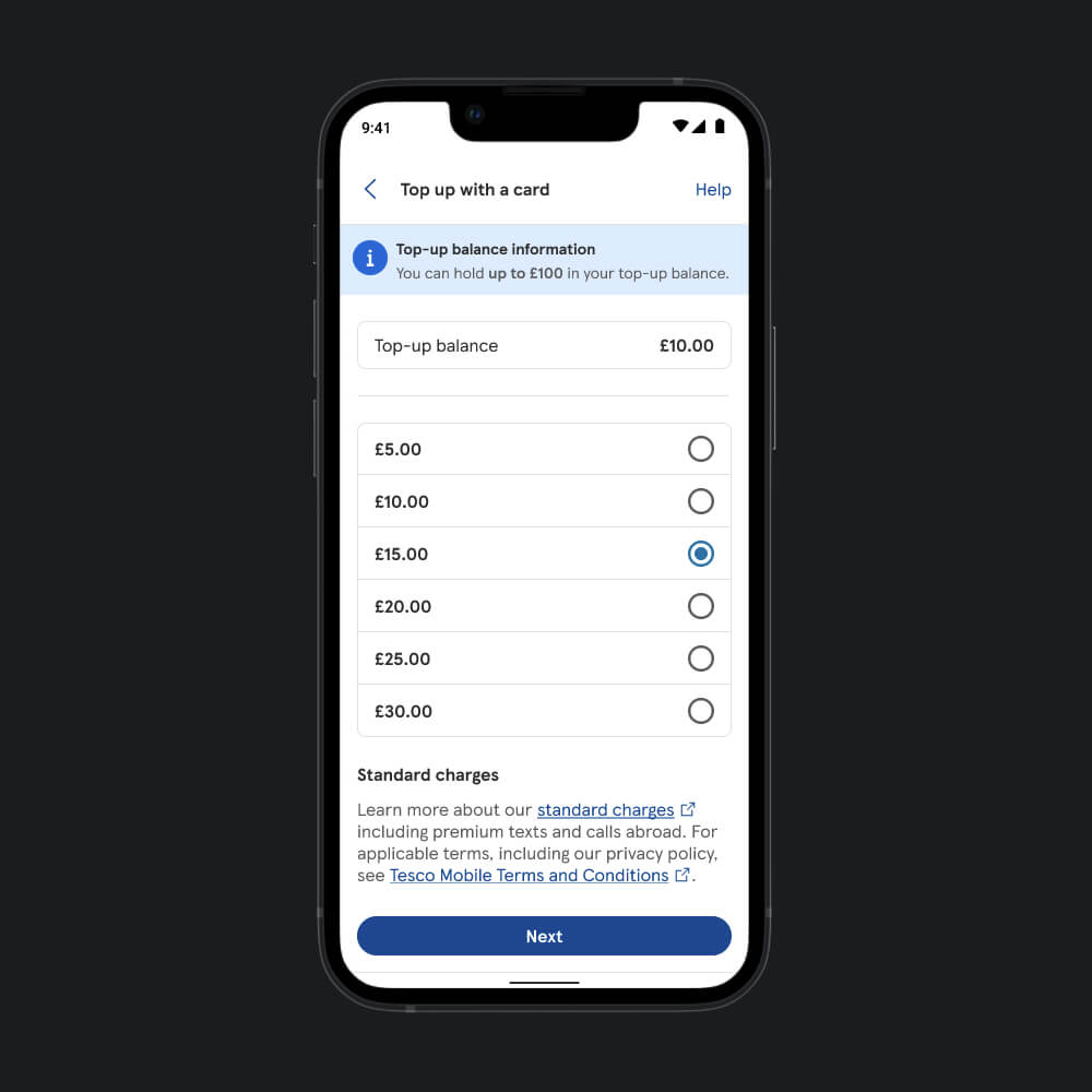
Final Product
Some of the Key KPIs met:
- Streamlined the top‑up flow: reduced from 6 steps to 3, improving completion rates by +32%
- Improved app penerate by 66% within the first 2 months
- 18% reduction in PAYG support calls
- Streamlined the change bundle journey completion time from 1 minutes 28 seconds to 32 seconds
Before
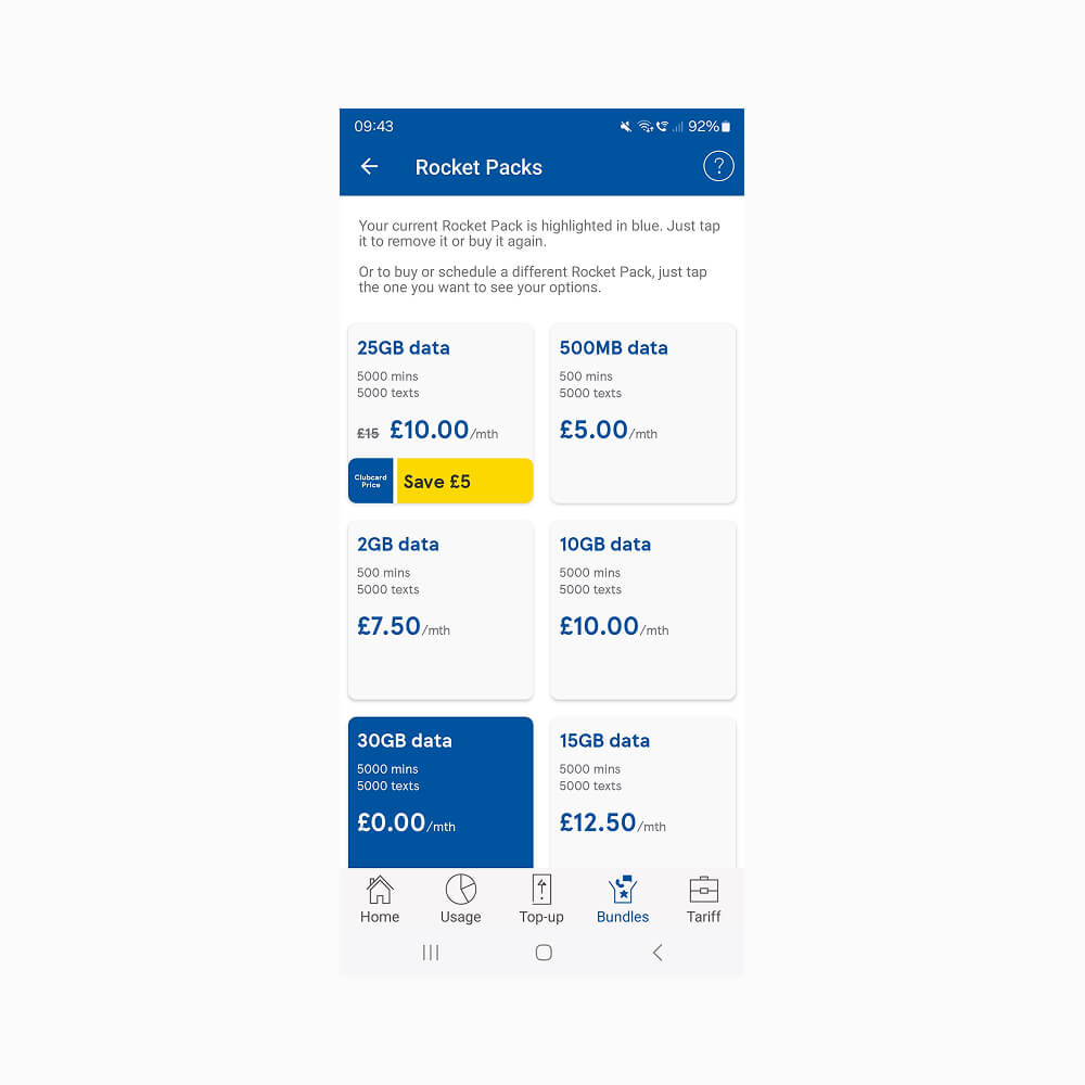
After